The British fashion house Burberry has just unveiled a new logo and monogram designed by Peter Saville, famed English graphic designer and art director.
https://www.instagram.com/p/Bl-VwDsHVvP/?hl=en&taken-by=burberry
The brand announced the change through their website and Instagram account last Thursday night. The new logo, with a sans serif, bolder and narrower spaced typeface, will replace the brand’s iconic Bodoni typeface and equestrian knight that has been in use since 1901.
Riccardo Tisci, Burberry’s chief creative officer, worked with Saville to redesign the company’s visual branding. This is Tisci’s first big move since being appointed in March, before he will unveil his first collection with the brand in September.
https://www.instagram.com/p/Bl-LSk1HXZA/?hl=en&taken-by=burberry
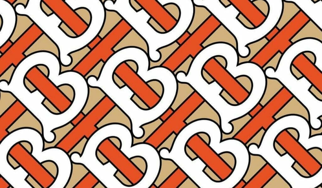
Along with the new logo, a “TB†monogram – for the brand’s founder Thomas Burberry – has been released. It is inspired by a 1908 monogram that Tisci found while doing archive research, according to images posted on the label’s Instagram account.
The red and honey monogram will appear on its own or in an interlocking pattern in all the brand’s marketing from today onwards, along with its new logo.
With this more contemporary visual identity, we’re looking forward to see what else Tisci will bring for Burberry’s future.


