What do Celine, Burberry and Calvin Klein have in common? Only the fact that, in recent times, they have rebranded themselves only to end up with uncannily similar sans-serif logos: bold, black, and kind of boring.
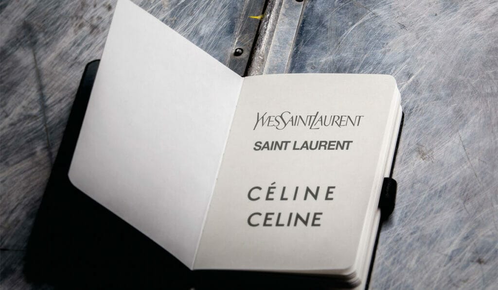
In September, Celine’s new creative director, Hedi Slimane, unveiled a logo that did not have an accent over the first “eâ€. (It wasn’t Slimane’s first iconoclastic act; when he joined Yves Saint Laurent (YSL) in 2012, he decided to axe the “Yvesâ€. The move, perceived as one that distanced the brand from its much-respected founder, was derided by the brand’s fans.) Just months before Celine’s facelift, Riccardo Tisci joined Burberry and abandoned the brand’s heritage logo in favour of a plainer Peter Saville-designed word mark. The same Peter Saville designed Calvin Klein’s all-caps logo when Raf Simons took the reins last year.
Sure, a new logo acts as a tabula rasa when a fashion house sees a change in creative leadership. But the sameness of these modern minimalist designs reveals a baser need: survival in the digital world. A smart logo has to be simple yet invincible. It has to render well, and be recognisable whether as an avatar or a split-second GIF. Despite the initial outrage at the replacement of the YSL logotype with a Helvetica font, Saint Laurent’s sales increased by 150 per cent during Slimane’s tenure.
Coincidence or not, it’s worth remembering that a logo isn’t the be-all-and-end-all of a business; a brand should still stay true to its values, and a designer’s creations should still speak louder than the weight of the logo’s typeface. If not, better luck with the next creative director.